

The University’s websites are now more easily accessible on mobile devices to students, faculty and staff.
Updates to the design of mobile websites over the past five years led to a 22 percentage-point increase in mobile users on GW websites between 2013 and 2018, officials said. Information technology experts said an upward mobile trend is occurring nationwide and allows the University to make a positive first impression with prospective students and design websites more effectively for users.
University spokeswoman Maralee Csellar said as mobile usage has grown, the Information Technology department has looked for ways to improve the readability and aesthetic of their websites. She said websites use frameworks that support “responsive design,” which adjusts the size of the website to the size of the mobile device.
“Adopting frameworks enables the University content creators to focus on the content and reduces the need for them to design for numerous devices,” she said in an email.
More than 300 campus websites – like the summer housing page and the GW Blogs platform – currently use the frameworks, and mobile usage increased from 10 percent in 2013 to 32 percent this year, she said.
Csellar declined to say how many were not considered mobile friendly and how much it costs to update the sites. She also declined to describe challenges to making sites more mobile friendly or to describe user complaints about apps and websites on mobile devices.
The IT department revamped the website myGW earlier this month, increasing the text size and offering more sizing options depending on the device used, according to an email sent to students earlier this month. Students could experience inconsistent formats during the unspecified maintenance period but no service interruption, the email said.
GW has also announced changes to website design using InfoMail emails from the Information Technology department this year. The sign-in for email on GW Google apps was updated to a single sign-on page in the fall, which makes the sign-in process quicker with only one username and password, according to a University email in September.
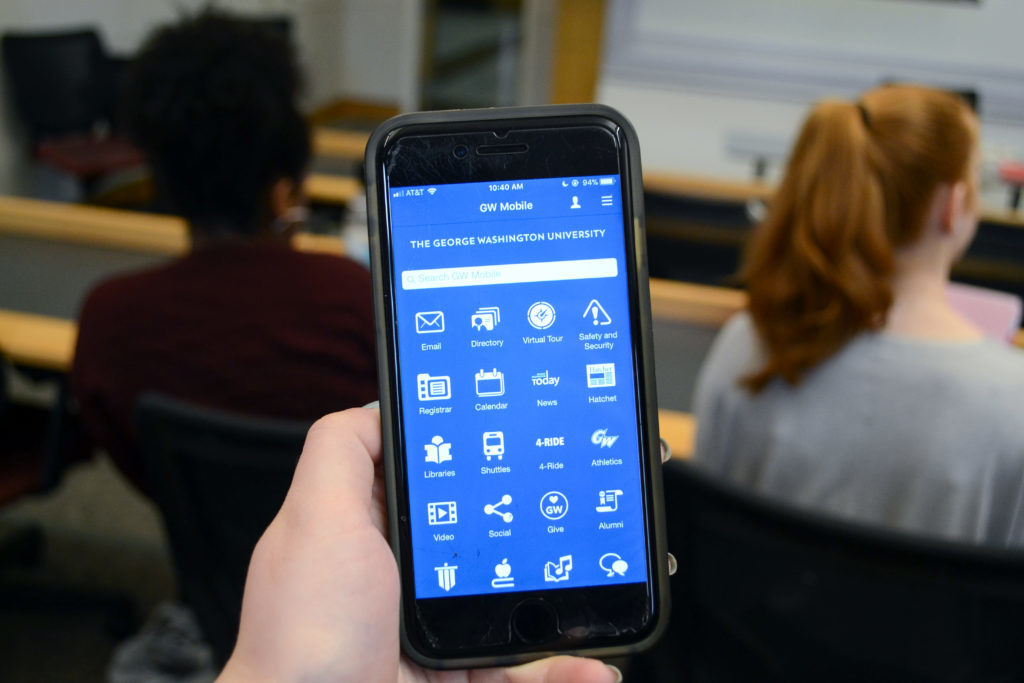
The University added more features to its mobile apps in recent years. The main GW app was developed in 2015 to allow students to track 4-RIDE, and the safety app, GW Pal, was updated last spring to allow campus security officers to track students once they indicated that they were in danger.
Martin Sickafoose, the vice president of alumni digital strategy at Purdue University, said most mobile traffic is coming from a younger audience, primarily composed of prospective students looking to learn more about a university.
If officials can make the first interaction prospective students have with the University a positive one with an engaging mobile site, students are more likely to revisit the site and read the content to convince them to attend the school, he said.
“We want to lead off with a pretty bold video or visual, more than a standard story of the university,” he said.
This push to digital-first and responsive design, which costs approximately $500,000 for Purdue over six months, has paid off with mobile site traffic more than doubling within a few months after the first implementation in 2013 and steadily increasing with smaller website updates since, Sickafoose said.
He added that making the University more accessible for mobile users can also attract students from underrepresented communities, who tend to have mobile phones rather than a laptop or other device as their only source of Internet.
“By presenting this information to them, that’s where you are making a connection with them,” Sickafoose said.
Rick Buck, the director of digital services at the State University of New York in Oswego, said the desire to improve mobile websites has forced developers to be more strategic to make content fit on a smaller screen. Buck said shrinking the amount of content available on a page makes it easier to read and more effective in getting across a message.
“The great thing about doing things mobile first is you figure out who is accessing your information so that you present it in a more streamlined fashion,” Buck said. “It forces you to know what your audience is looking for.”