Great design magnifies great storytelling.
That’s what we’re shooting for this year at The Hatchet, so we launched a print redesign today to mark our first weekly edition. (You can read the PDF here, and it will hit stands across campus this afternoon. The PDF of last week’s issue is here for comparison.)
Let me explain some of the changes that our all-star design team (design editor Jenna Bernick and visual director Nick Rice) put in place. This might get a little “in the weeds,” but hopefully it’s interesting:
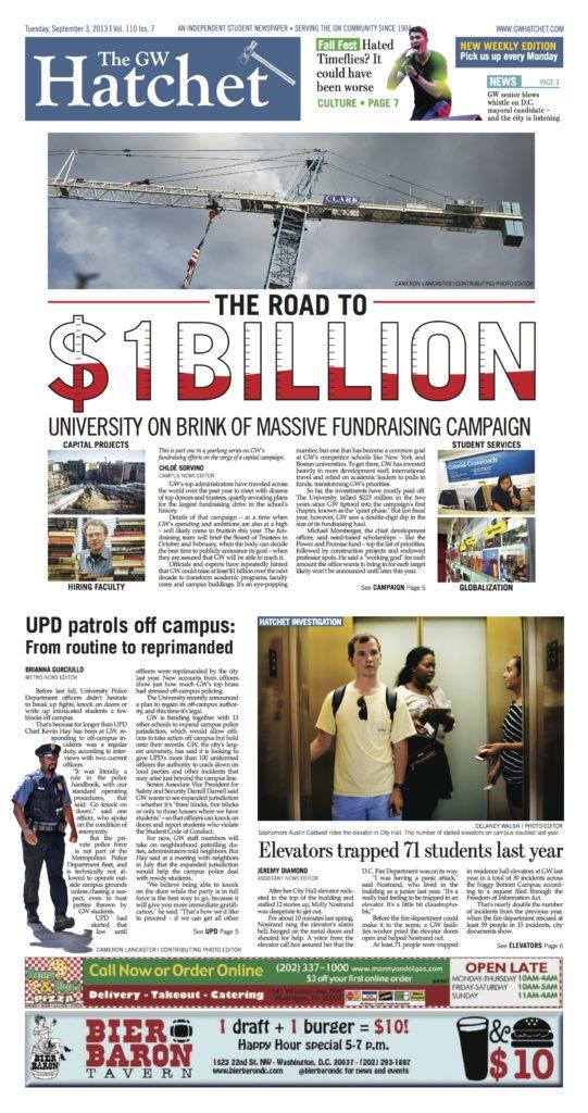
- More space for enterprise stories: Before, we put four or five stories on each front page. We’re dialing that back to two to three on the front each issue. That leaves more room for graphics, pullouts and other features that connect the dots on stories. This is key because with our new weekly edition, we want to inform and educate readers with stories that require deeper reporting and more colorful storytelling. You’re already going to our website and social media for breaking and straight news.
- A new nameplate: We ditched the statue of George Washington that was at the top of the newspaper and created a new nameplate – complete with a new “hatchet” logo that modernizes The Hatchet’s brand while remaining committed to our 110 years of history. We think the new nameplate on each section front will allow for more flexible design (including allowing us to bring back teasers and more pullout info). And the top of the page just looks cleaner now.
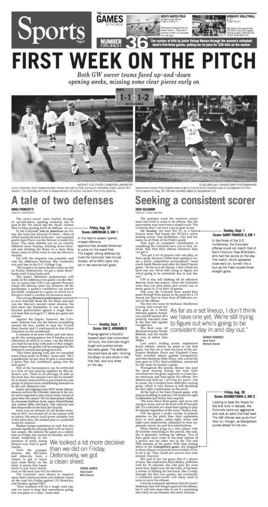
- More white space: In the past, we haven’t used white space as effectively as we should. We’re really hoping to give stories space to breathe, allowing white space to serve as natural guides to the newspaper. This is best exemplified on our Sports page this issue (below).
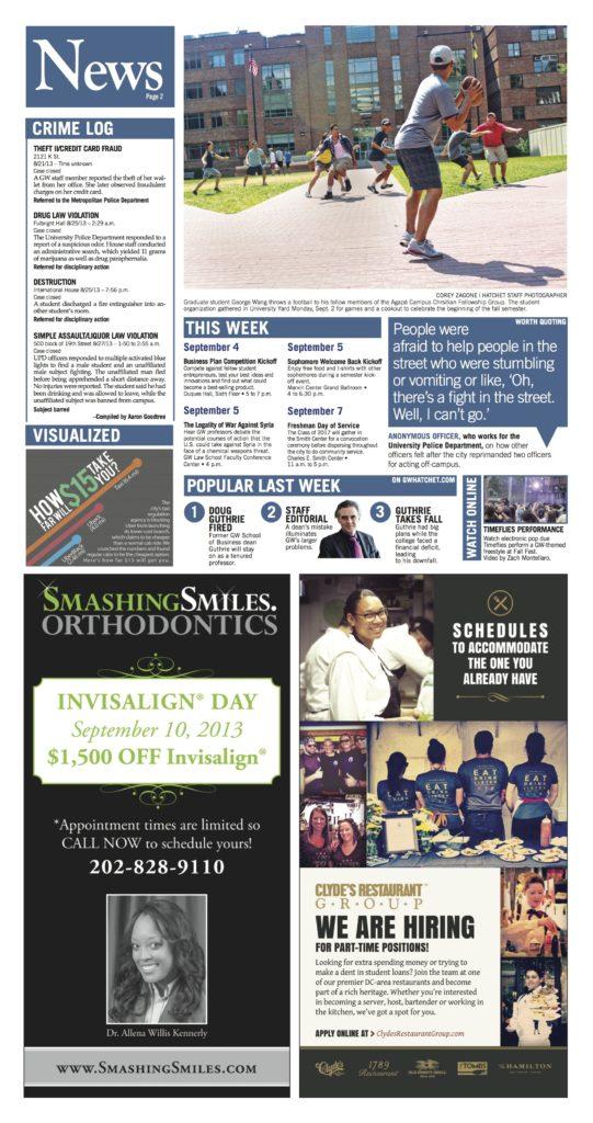
- A new Page 2: The new design has a magazine flair to complement a traditional newspaper look. That philosophy is really embodied on Page 2, which includes more pullout information that serves as a helpful/interesting first chapter to the paper.
- New font: For you typography geeks, we abandoned Franklin and are now using Trade Gothic as our go-to sans-serif headline and cutline font. We’re still using the Escrow family for our serif font on the page.
(This is a good time to plug that we’re still looking to hire more designers because Jenna and Nick are doing it almost single-handedly right now. Email [email protected] by Thursday if you’re interested.)
You may now be asking: “Hatchet, shouldn’t you be focused on web design too?”
Yes, of course. Check out this special page that our web team designed for Chloe Sorvino’s story on GW’s billion-dollar fundraising campaign. (If you have glitches with that page today, bear with us as we work on patching it up to work on all browsers.) We’re also aiming for more interactive graphics, like the campus map that accompanies our story on elevator malfunctions. In the future, expect more design changes to our website as we bring on more coding hands. (Which reminds me, email [email protected] if you are interested in joining our web team.) A mobile-friendly site and mobile app are in the works, too, to complement what has been named best college newspaper website in the region multiple times.
We would love feedback on all these changes. If you love or hate what we’ve done, tell us why in the comment section or tweet at us @gwhatchet.
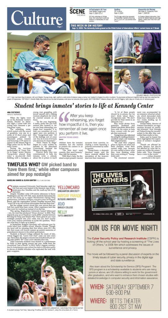
Here are some other redesigned pages from this issue:
